Visualizing progress: Mapping women's political leadership
Empowering change through data and design
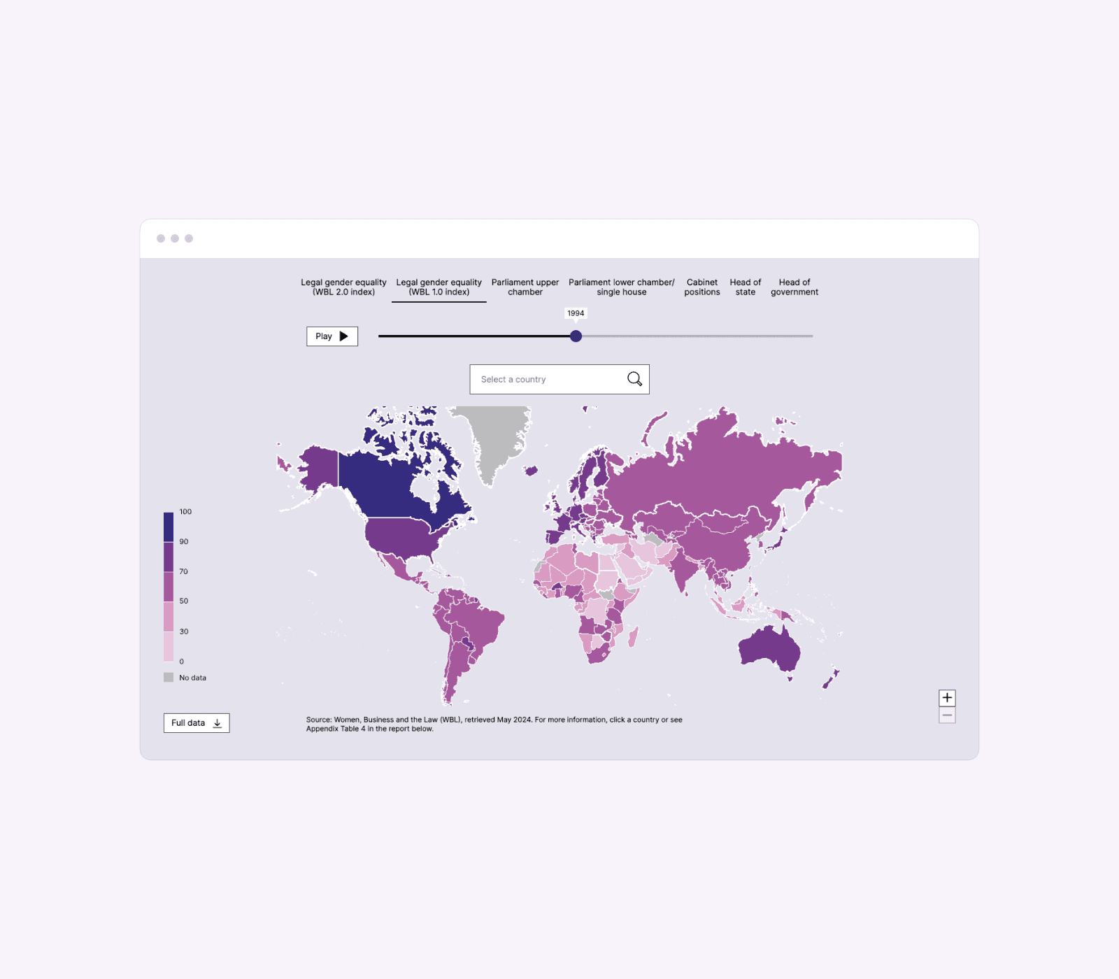
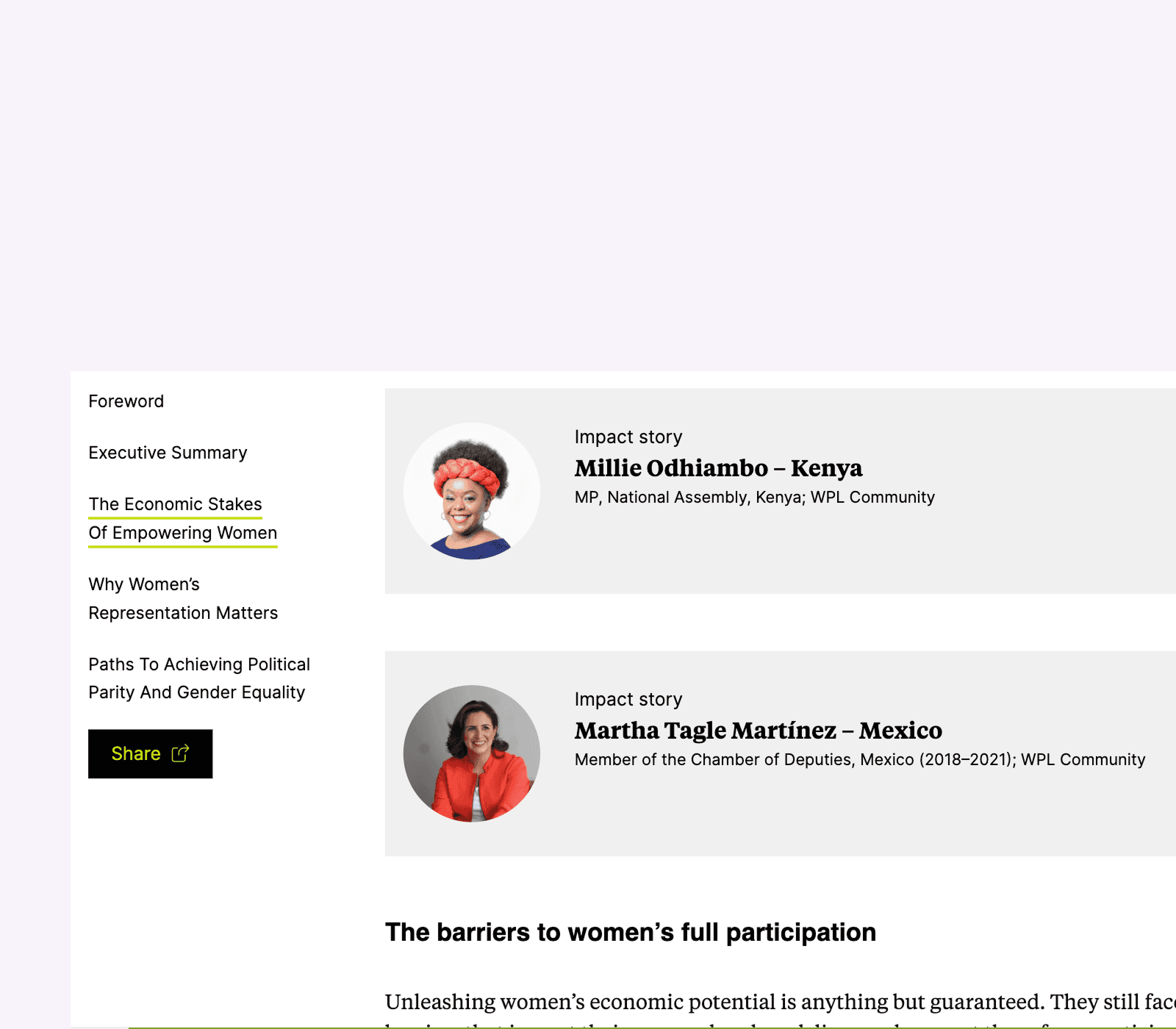
The key stakehodlers from the different companies involved aimed to explore how women's political leadership can accelerate global economic growth. To support this initiative, a content-heavy digital platform was developed, featuring an interactive map displaying data points across multiple countries over five decades. This map aimed to highlight key trends and insights, while the platform also showcased real-life stories of impactful women leaders.


The challenge
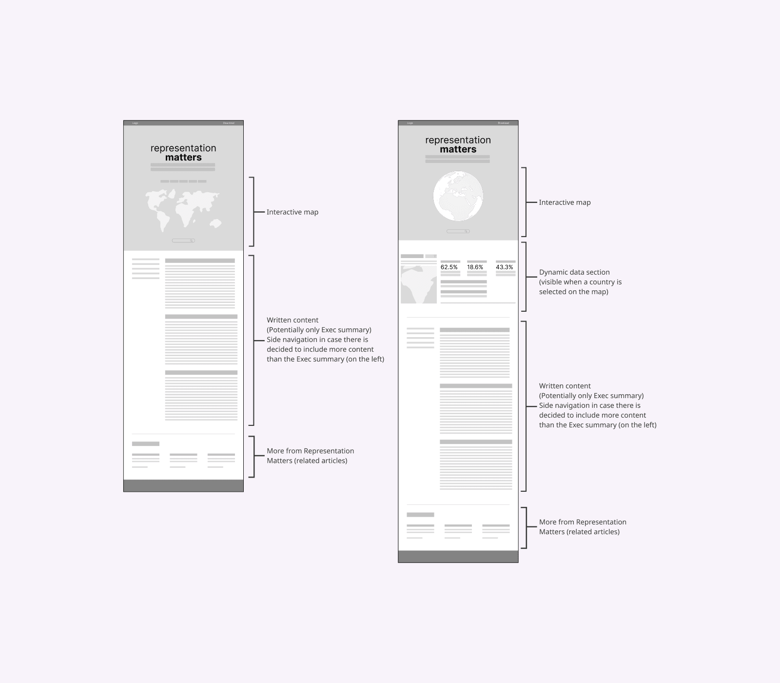
The main challenge laid in visualizing extensive data within a user-friendly experience. The interactive map had to accommodate numerous data points, covering different topics across a 50-year timeline, all while maintaining clarity and engagement. Additionally, integrating the 'Impact Stories' section — showcasing real-life examples of women leaders — required balancing storytelling with data visualization. Managing this complexity while meeting a tight initial deadline added further pressure.
The solution
To tackle these challenges, I collaborated closely with key stakeholders to understand the project’s goals and priorities. I began by developing low-fidelity mockups to outline the site's structure and ensure that the content-heavy nature of the project remained organized and accessible. This approach helped define the optimal flow for both the interactive map and the narrative-driven 'Impact Stories' section. Once the experience was established, I refined the visual design through high-fidelity prototypes, ensuring the site remained engaging yet functional.
Additional thoughts
This project balanced storytelling and data. A clear wireframe helped users explore insights easily, though streamlining conten (like trimming appendices) was a challenge.